Sticking is one of the most common problems of tablet manufacturers. Preventing unanticipated problems prior to scale-up and full-scale production should be considered before the tablet designs are finalised.
The first step in solving a problem is to understand where the problem begins and why it is reoccurring.
Sticking and/or picking occurs when granules or particles from the formulation attach and stick to the face of a punch cup, resulting in defective tablets.
Picking is a specific type of sticking that refers to material becoming stuck on the faces of the compression tooling due to embossed designs, such as the letter or numerals of the tablet logo or identifier. Sticking or picking issues are often not detected until transferring the product from research and development to production.
Identify the root cause
Although sticking and picking are frequently related to deficiencies in tablet design, remediation does not always require changing the design, and thus the tools used for tablet manufacturing. It’s important to first rule out the following conditions: increased moisture in the formulation, insufficient compression force during tabletting, or an inadequate amount of lubricant within the formulation.
The insufficient compression force is also a potential source of sticking/picking because the compaction of the powder is not complete. When this occurs, the adhesive forces of the punch are stronger than the cohesive forces of the inadequately compressed tablet.
Another potential cause of sticking and picking is a deficiency in the amount of lubricant within the formulation. An increase of lubricant will impart greater release of the compressed tablet from the punch cup surface.
Carefully inspect the punch cups on your tooling as surface scratches can capture small particles of the formulation which can lead to filming, a preliminary stage of sticking and picking.
When simple or environmental fixes are not enough, a full tablet design review may be necessary. Tablet design plays a pivotal role in oral solid dosage manufacturing, although it’s often overlooked.
Typically, a pharmaceutical company’s marketing department pushes for certain tablet shapes and logos with the end goal of promoting brand recognition. However, those designs may not be optimal for manufacturing requirements and demands. Compression tooling suppliers, who are often highly-experienced tablet design experts, can identify potential sticking and picking issues before tablet designs have been finalized, thus reducing production challenges.
If troubleshooting methods prove unsuccessful, you will want to consider changing the font, design, or placement of the tablet’s logo or identifier.
Font selection: Serif versus sans serif
Font selection is often a battle of form versus function. An ornate or decorative serif font can be more prone to picking problems than a simple, sans serif font (see Figure 1). The variations in engraving width and the isolated peninsulas—partially enclosed areas—of serif font letters are impediments to even powder compaction. This variation often leads to powder picking away from the compressed tablet core and remaining in the punch cup.
A sans serif font requires wider, more uniform engraving widths and larger corner radii, which helps to minimize picking, increase the likelihood of consistent powder compaction, and yield the best overall cohesive force for the tablet.
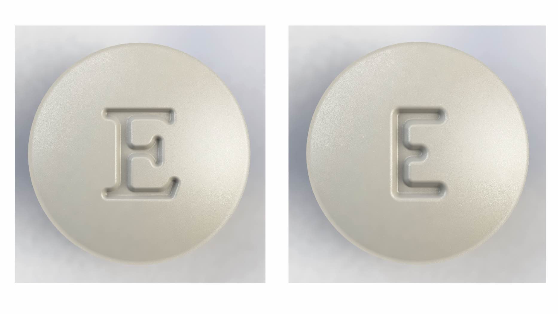
Figure 1: Decorative or serif fonts (left) are more prone to picking problems than simple sans serif fonts (right)
You can address picking problems during tablet design by modifying the embossed letters or by using compound-cup configurations to improve compression in the punch cup's deepest areas.
A compound cup is any concave cup whose profile is controlled by two radii instead of one. With a compound cup, the cup depth major radius and minor radius all control the profile. Typically, the radius near the edge is smaller (more curved) and the radius in the centre is larger (flatter).
The compound-cup configuration allows for greater control over the cup surface's curvature, allowing optimization of the surfaces directly around the logo. It’s important to note that if the tablet is film-coated then the cup must remain curved. Any flat surface on the cup can promote twinning.
The engraving cut
Although it's important to consider the engraving's font or typeface first, you should also pay attention to how the engraving is cut. For example, consider the number nice (9) as a result of the engraving, an island is created by the fully enclosed area within the 9.
A peninsula is formed in the small area between the loop of the 9 and the tail. These are the areas that are most prone to picking when the tablet releases from the punch face. Pre-picking some letters and numerals by decreasing island depth and tapering peninsulas can often alleviate this problem.
To reduce or eliminate material picking in the centre island of the numeral 9, the tablet design can incorporate pre-picking. Pre-picking is to intentionally adjust the depth of the engraving on the cup face to decrease the height of the island. It is typically reduced by 50% although the amount of the reduction in island height can range from 10 to 100%, depending on the extent of the picking problem.
Be aware that an excessive pre-pick can significantly reduce the clarity of the logo if you coat tablets post-compression for branding or aesthetic purposes. The partial pre-pick concept is applicable to any letter or numeral with fully enclosed areas.
To eliminate the likelihood of picking at a peninsula, you can employ tapering, or ramping. This is a technique that starts at the peninsula's open end and tapers downward toward the peninsula's enclosed end by a percentage of the engraving depth. Peninsulas usually taper to between 10% and 50% of engraving depth, with 30% being the most common.
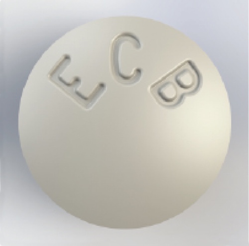
Figure 2: Out-of-centre placement of engraved text can reduce picking
Logo or identifier placement
Although the font selection and the design of the engraving cut are two crucial aspects of tablet design, you should also pay attention to the placement of the identifier. You can modify the size and spacing of the characters to reduce the occurrence of picking.
Additionally, moving the characters out of the centre, as shown in Figure 2, can also be an effective option.
When air becomes trapped or retained during compression, it is forced towards the farthest point in which it can travel, i.e. the centre of the tablet.
These small amounts of entrapped air result in a decreased compression force at the centre or deepest portion of the cup, creating a “soft spot”. These softer spots are more likely to stick/pick as it is a localized density gradient. However, by moving the logo from the centre, the powder flow is altered during compression to alleviate the centralised air entrapment.
Consult with a qualified tooling vendor and discuss sticking and picking issues early in the development process to help reduce potential production issues and costs associated with purchasing redesigned tooling.
Several remedies can help eliminate sticking and picking, ranging from slight formulation changes to the tablet design to tooling modifications. It's important to discuss all product properties with the tooling vendor during the tablet-design phase to eliminate sticking and picking issues before they occur.